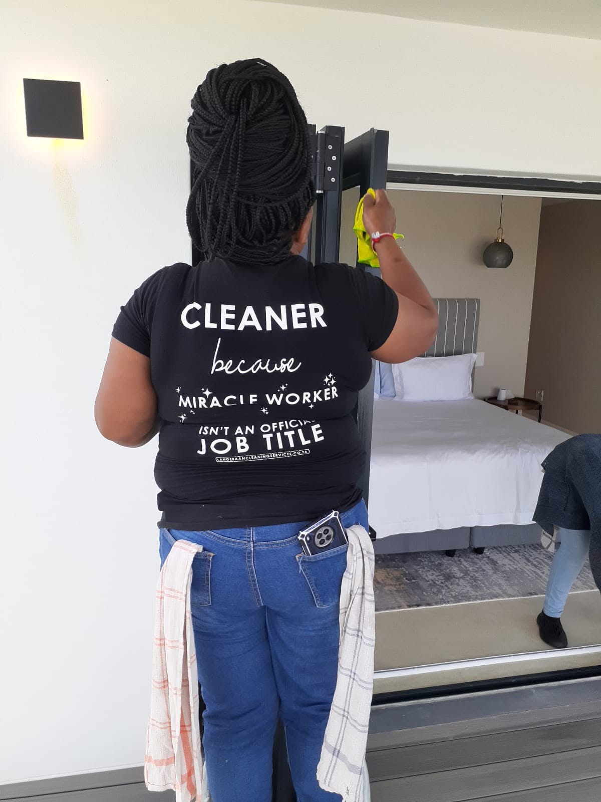
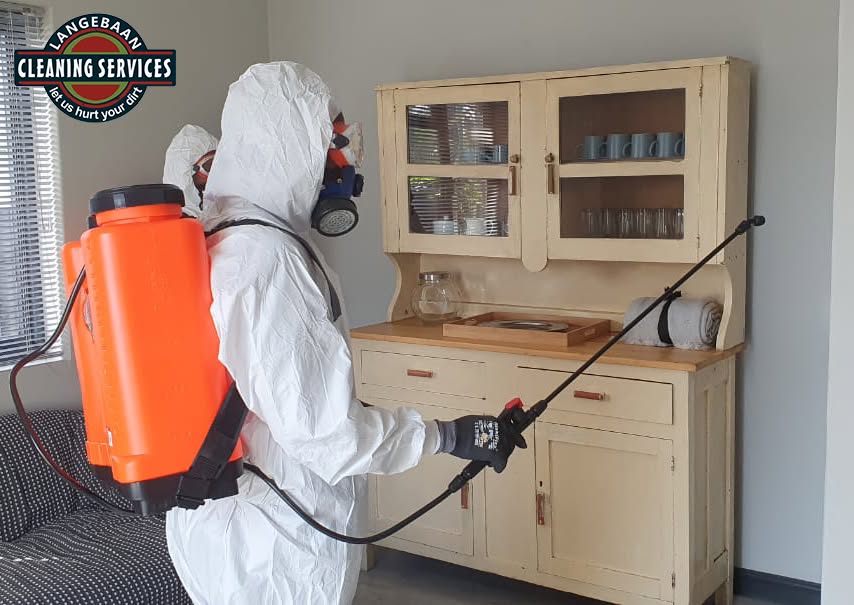
LCS partnered with me to Develop their brand profile, as well as mirror the brand visual for LCS’s sister company SBCS (St Helena Bay Cleaning Services). In addition I also Designed, Developed & Maintained the LCS website.
LCS also approached me to develop a Lead Generation Campaign for it’s residential clients in the West Coast.
Design
[ Click on the links below to go to their respective sections: ]
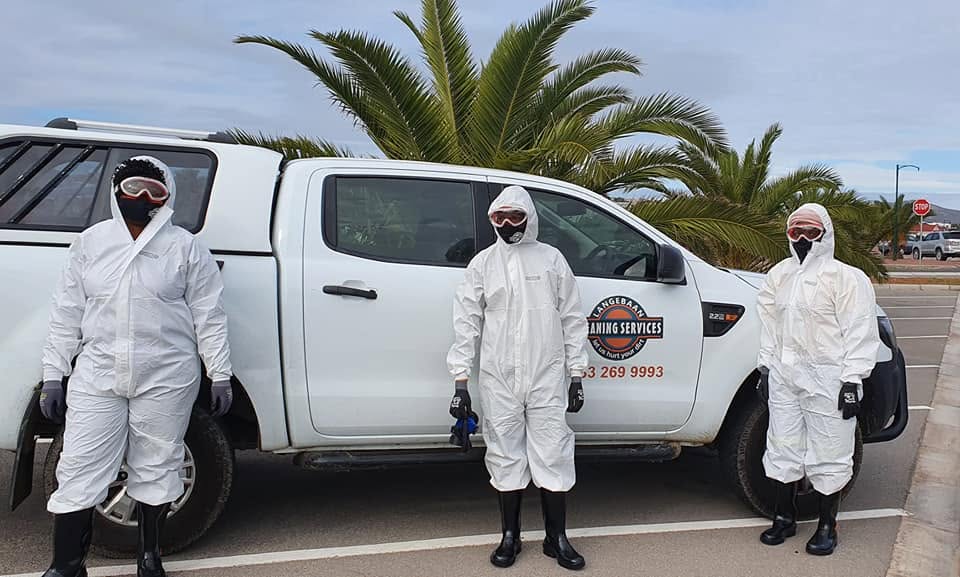
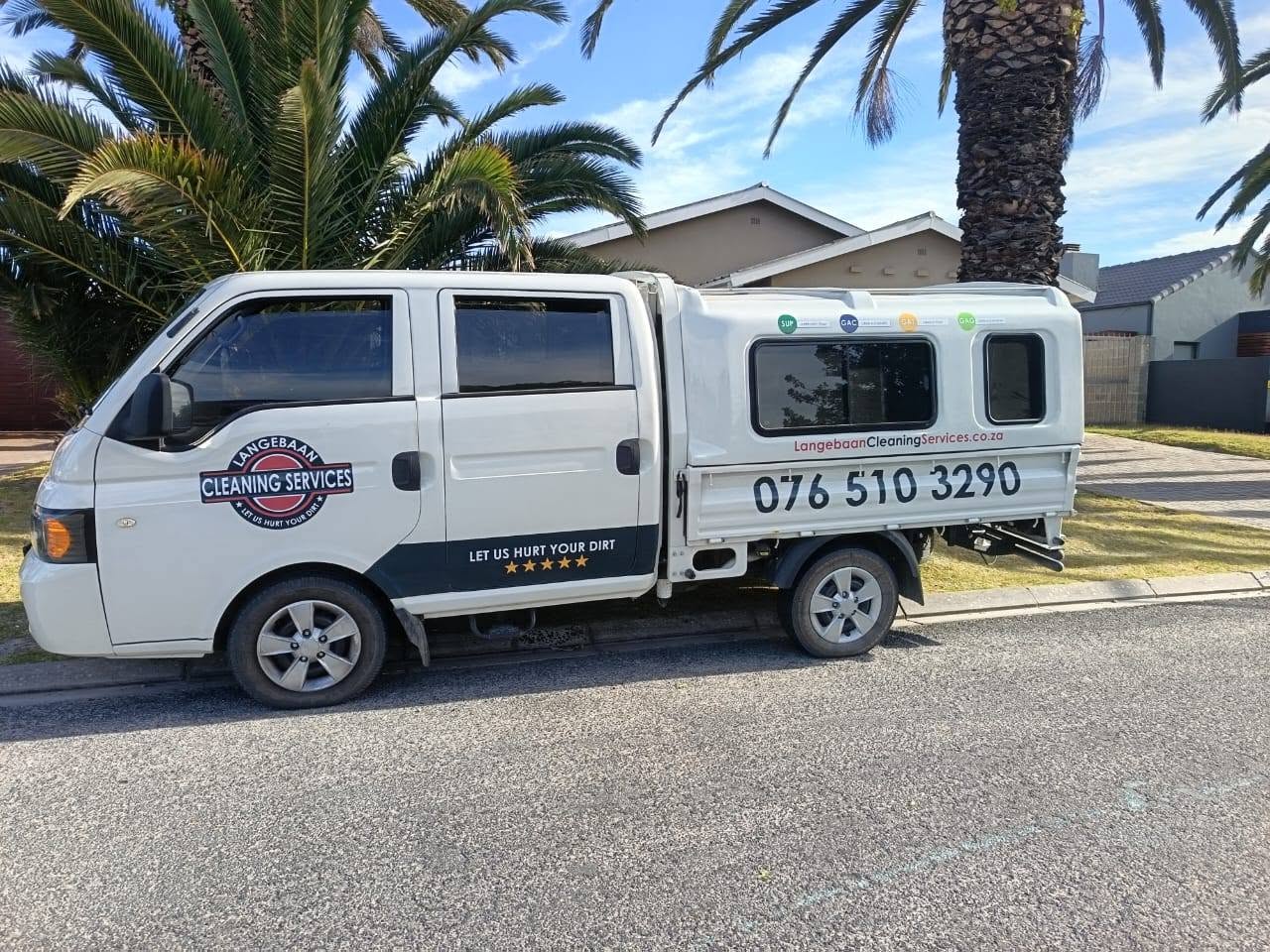
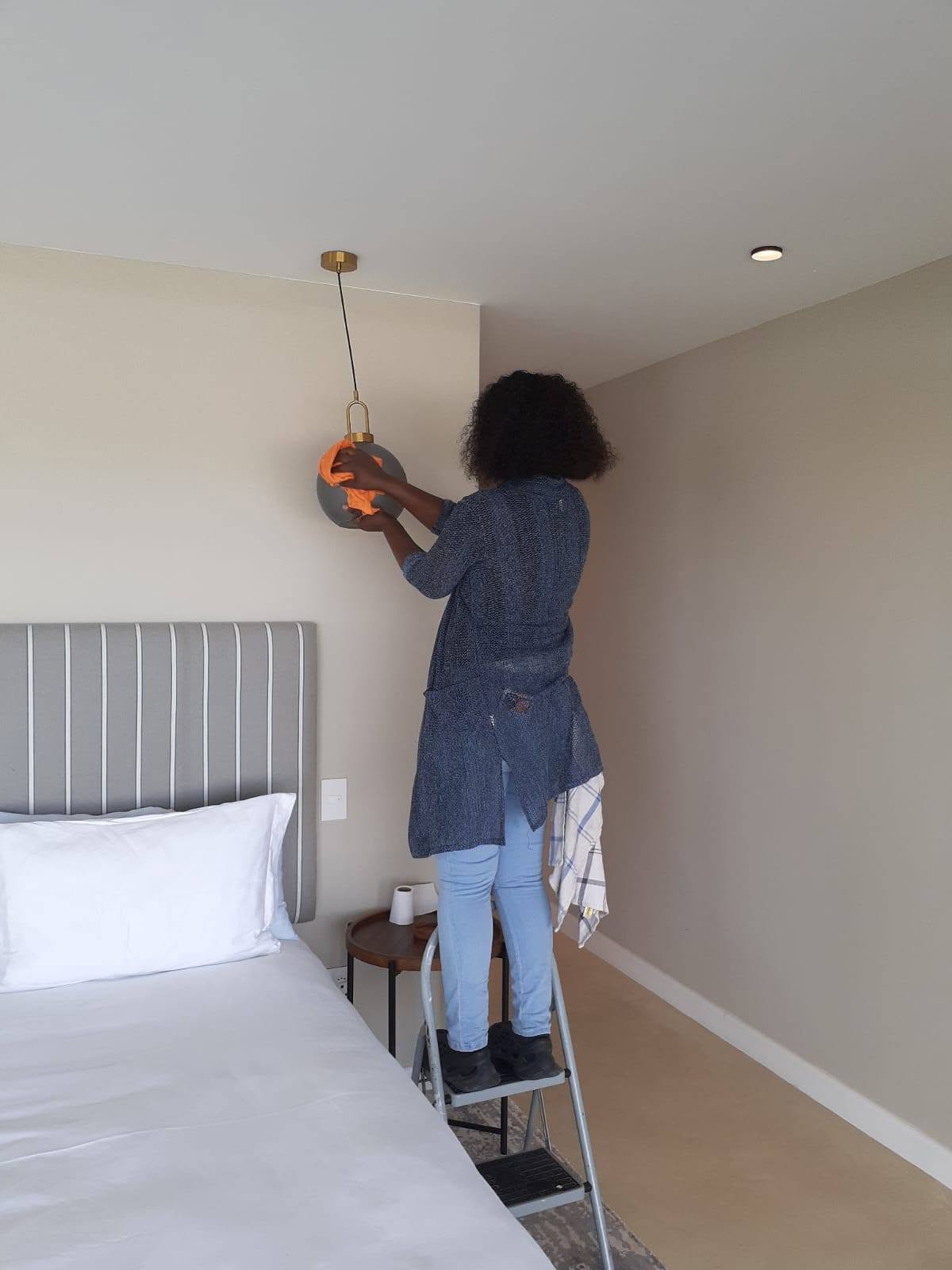
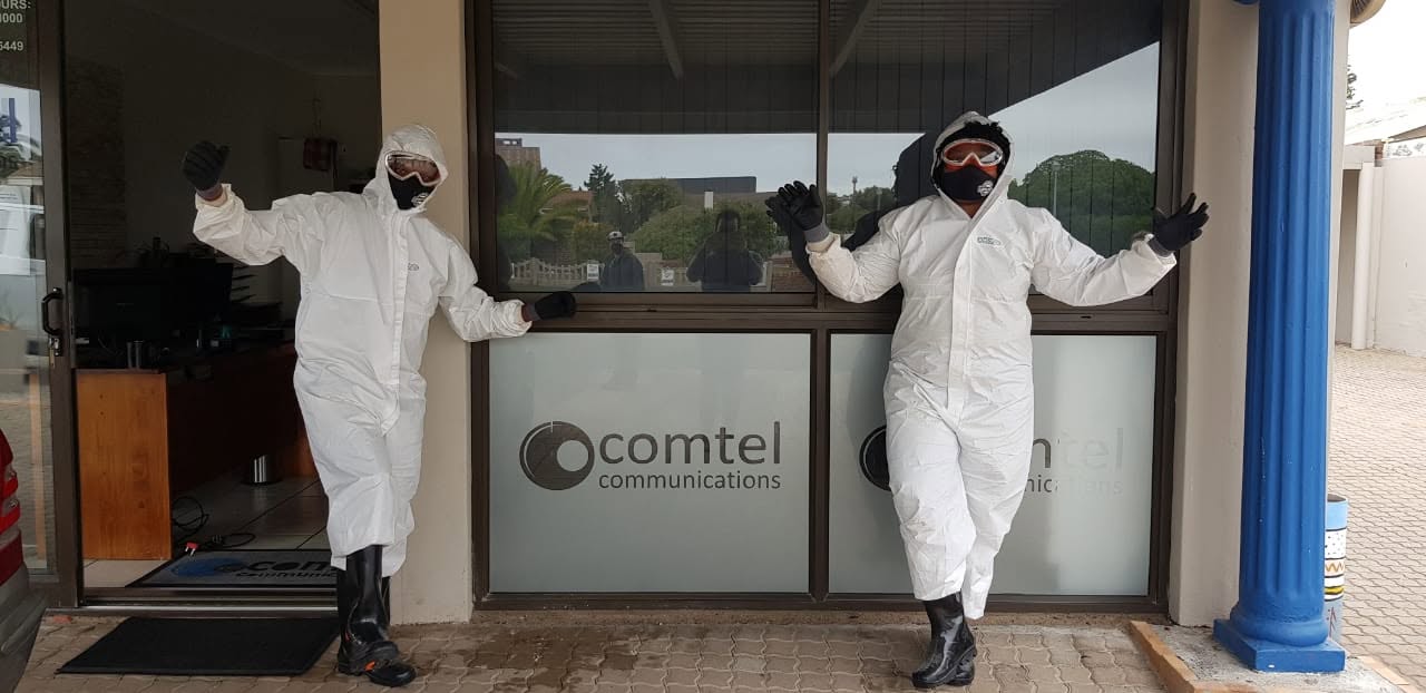
Founded as a hands-on, owner-operated startup with a single team using personal household tools, LCS has scaled into a leading cleaning services provider across South Africa’s West Coast region. By prioritizing quality control and strategic marketing initiatives, the company systematically expanded from individual residential contracts to managing complex corporate operations. Today, LCS maintains a versatile portfolio serving residential properties, luxury holiday rentals, commercial facilities, and large-scale industrial enterprises. The firm’s proven operational capacity is reflected in its track record of executing projects for major industrial stakeholders and public entities, including WBHO, Transnet, Saldehco, and the Saldanha Bay Municipality.
Before
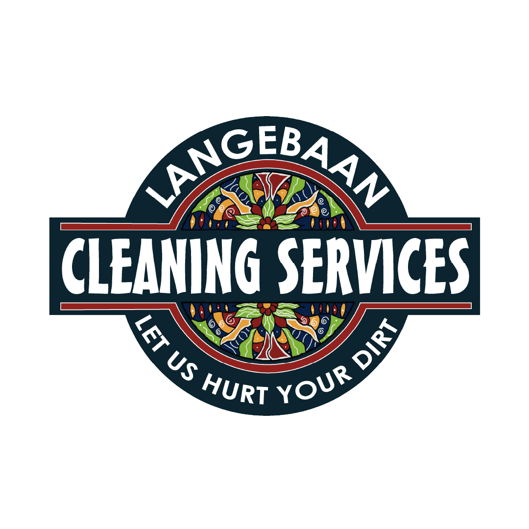
After
I wanted to modernize the logo to reflect the company’s growth while preserving its recognizable shape. Because the LCS brand is already well-known and trusted across the West Coast, changing the entire identity didn’t make sense. The goal wasn’t a total redesign, but rather a fresh, clean upgrade that respects their established market presence.
I swapped out the original bi-colour stacked elements in the centre for a custom, hand-drawn mandala. This design draws direct inspiration from the cascading spring flowers the West Coast is known for. It subtly links LCS to the region’s unique story while using a handcrafted style to honour the company’s hands-on roots.
I swapped the flat divider for a bolder, more defined version. This makes the logo cleaner and easier on the eye, while acting as a nice visual anchor that compliments the intricate centerpiece artwork.
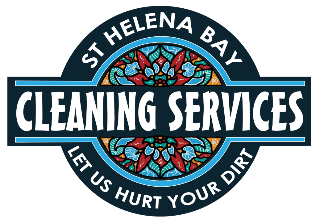
The St Helena Bay logo features its own original flower mandala design, paired with a light, breezy blue primary colour. The palette shift captures the coastal identity and directly aligns with the area’s beautiful sandy beaches.
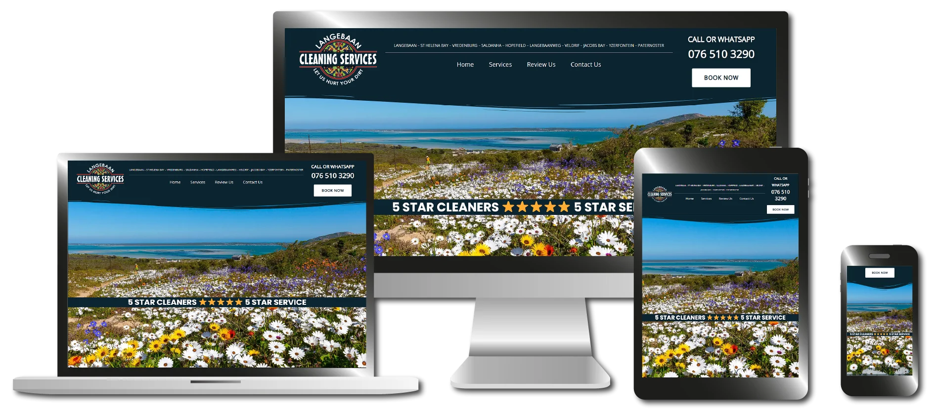
The main purpose of the website is to showcase LCS’s services and seamlessly connect customers to the right communication channels. Because most of their PPC ads click through directly to an in-house booking system, and their corporate contracts are largely secured through relationship-driven marketing, the site was designed with this exact flow in mind. It’s a clean, simple one-page website that gives users a straightforward outline of what the company does, how to contact them, and effortlessly links them to social channels, review platforms, and booking forms.
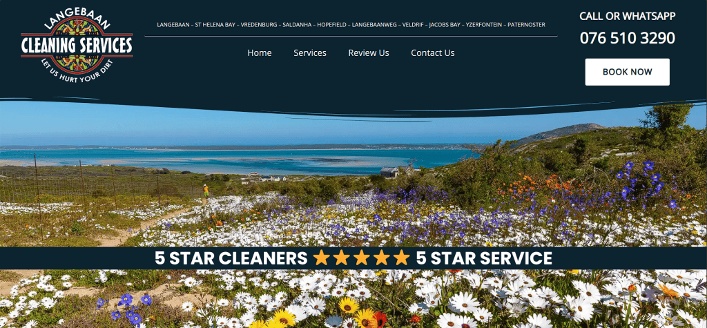
For the hero section, I started with a bold, high-resolution image of the West Coast flowers—the core inspiration for the logo redesign and a massive part of the local community. I overlayed the LCS motto, “5-Star Cleaners, 5-Star Service,” without obscuring the photo. Up on the nav bar, from left to right, sits the main logo, the navigation menu showing all LCS service locations, and a bold “Book Now” button in the right corner featuring the LCS contact number.
Services Section
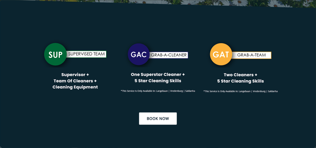
The second section breaks down the three core services that LCS offers: Supervised Cleaning Teams, Grab-A-Cleaner (single unsupervised cleaners), and Grab-A-Team (unsupervised teams). Each service option clearly outlines what the package entails, paired with a prominent “Book Now” button that redirects users straight to a booking form.
Branches Section
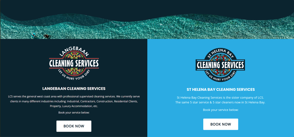
Next, the layout highlights the two primary LCS locations: Langebaan and St Helena Bay. Each branch features its own prominent “Book Now” button underneath to make booking specific regions effortless.
Review Section
The review section makes it incredibly easy for customers to head straight to LCS’s review platforms with a single click.
For HBM’s visual signature, a simple, sleek, and modern palette:
Bottle Green, Casual Black, and Pure White.
The primary Bottle Green evokes a warm, natural, and inviting atmosphere.
Instead of a harsh pure black, we opted for Casual Black, a deep, sophisticated dark grey, which, paired with Pure White, gives the brand a modern, high-end feel.
Midnight Blue
[Primary Colour] 60
Maroon
[Secondary Colour] 30
Yellow-Green
10
[ Typography ]
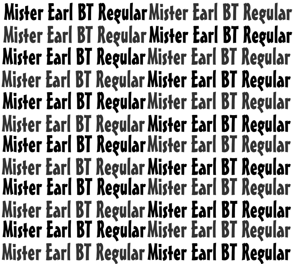
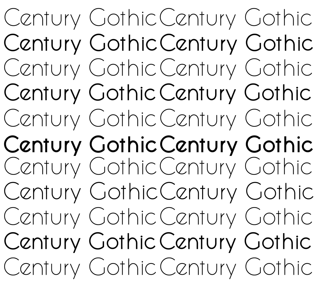
For LCS’s typography, I paired MisterEarl BT Regular with Century Gothic to create a balanced visual hierarchy. As the primary display typeface for headings, MisterEarl BT brings a whimsical, organic energy with its lack of rigid, straight lines. To anchor this quirky personality, I selected Century Gothic for subtext and subtitles, its modern, sleek geometric forms perfectly frame and balance the primary font.
MisterEarl BT Regular
(primary font)
a b c d e f g h i j k l m n o p q r s t u v w x y z
A B C D E F G H I J K L M N O P Q R S T U V W X Y Z
1 2 3 4 5 6 7 8 9 0 ! ? &
century gothic
(secondary font)
a b c d e f g h i j k l m n o p q r s t u v w x y z
A B C D E F G H I J K L M N O P Q R S T U V W X Y Z
1 2 3 4 5 6 7 8 9 0 ! ? &
[ Creative Deliverables - LCS - Lead Generation]
Lead Generation
Lead Gen - META Campaign
Audience Ages 25+, Pin Drop Location Targeting
Budget R 4000 Per Month
Destination Click to In House Booking Procedure
Ad Creative
Single Still Media Graphic
“Book Now” CTA
Results
± ____ Leads P/M with an ad spend of R 4000 ____ Leads over the last twelve months with ad spend total at ± R______. CPL: ±R__ per lead CTR: __%
Ad Creatives
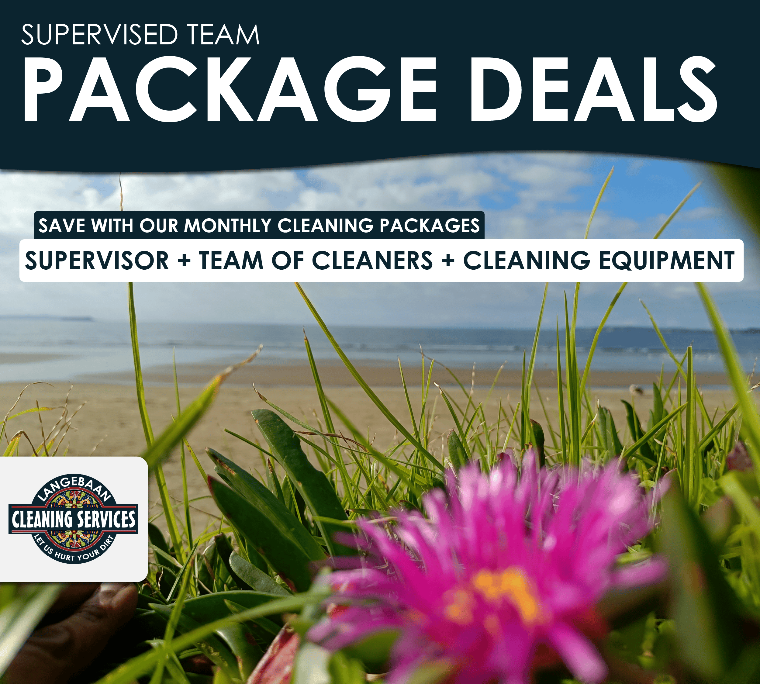
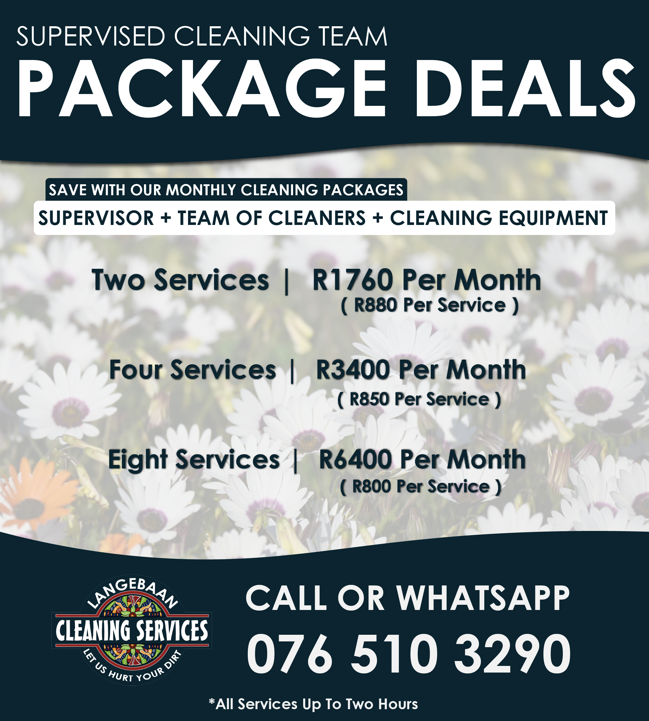
Lead Gen - Packages SUP
[ 25+ yo | Pin drop Locations ]
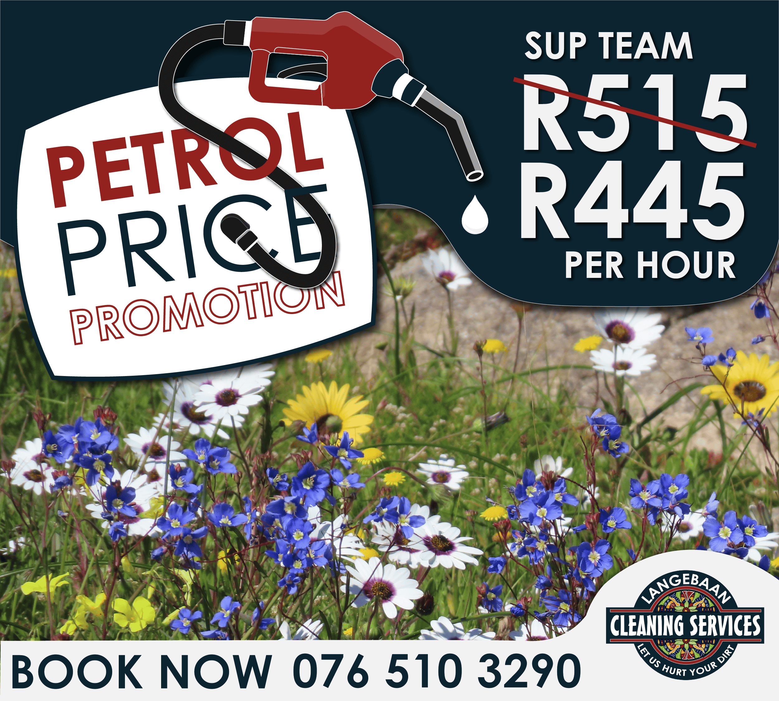
Lead Gen - Promotion
[ 25+ yo | Pin drop Locations ]
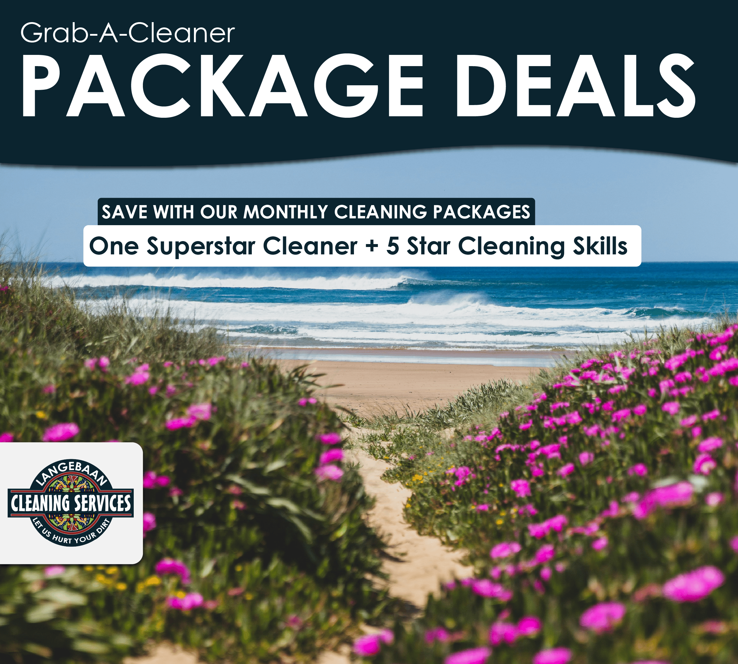
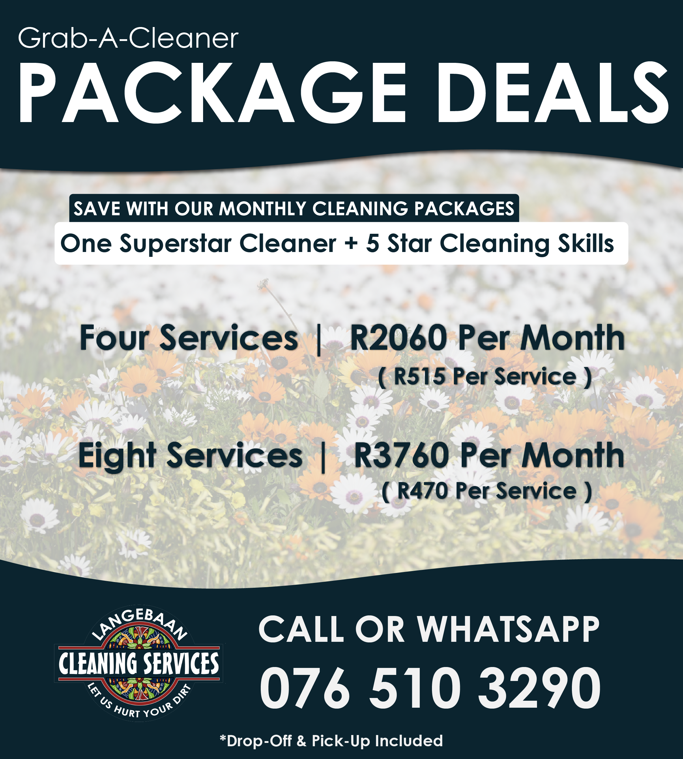
Lead Gen - Packages GAC
[ 25+ yo | Pin drop Locations ]
results
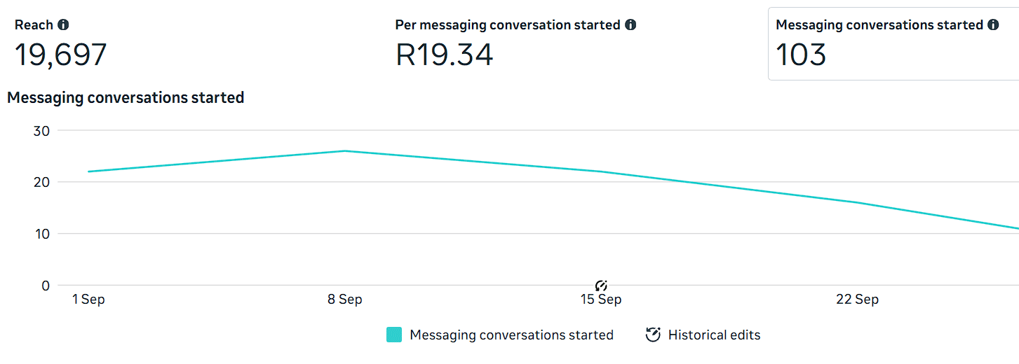
The Lead Generation Campaign generated 103 WhatsApp Conversations over a period of 1 calendar month. Cost Per Conversation Started was at R19.34 per conversation.
Ad spend over time
ROAS
[ Return On Ad Spend ]
Revenue From Ad Spend
=
Return On Ad Spend [ROAS]
Ad Spend
TOTAL AD SPEND
[ Over a 6 month period ]
Jan 2026 - June 2026
R0
Avg. ROAS
[ Over a 6 month period ]
Jan 2026 - June 2026
0x
TESTIMONIAL
Lorem ipsum dolor sit amet, consectetur adipiscing elit. Ut elit tellus, luctus nec ullamcorper mattis, pulvinar dapibus leo.