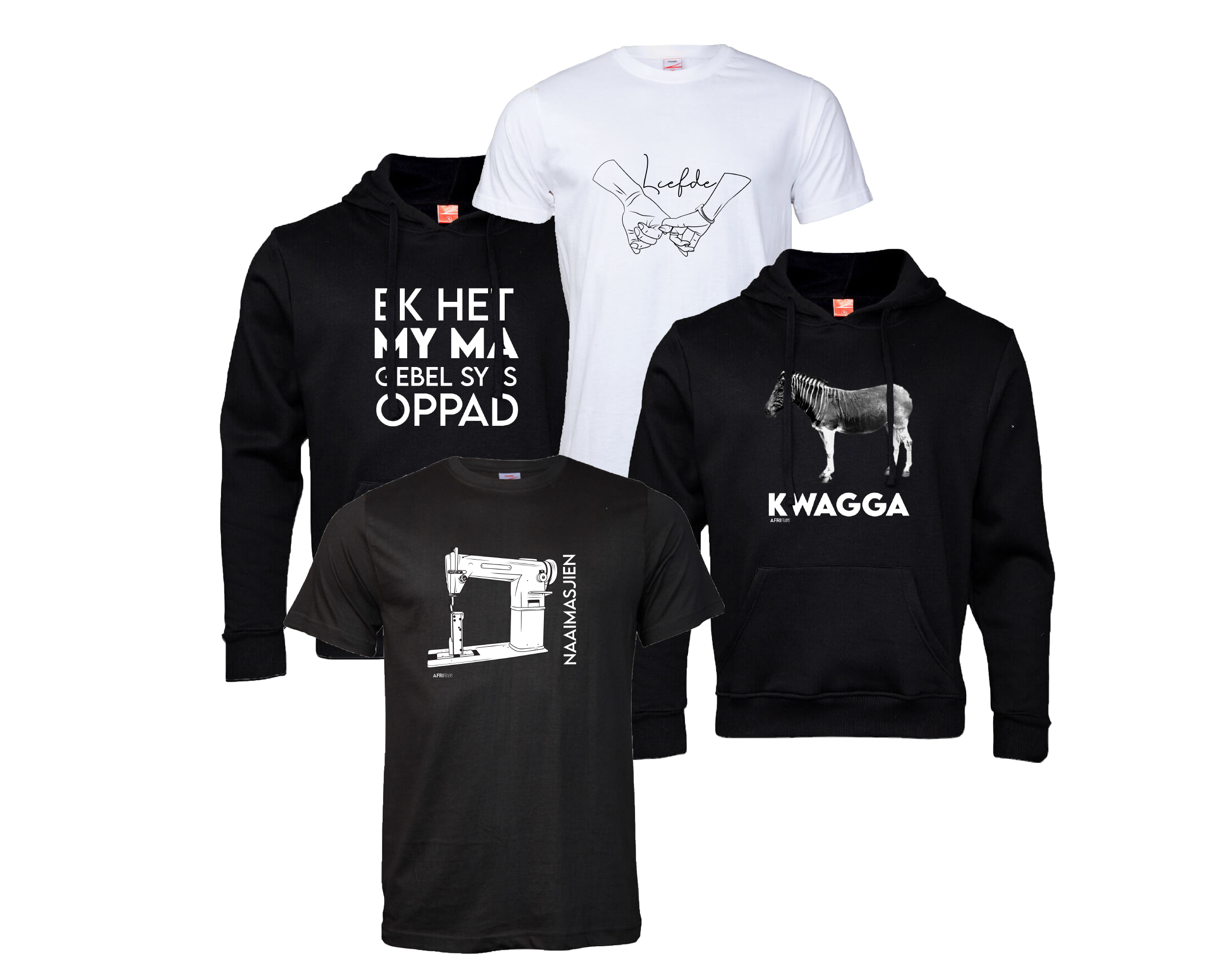
AfriFrans is a South African vernacular clothing brand. They mainly sell high quality T-Shirts, Hoodies, Headwear with custom designs. While some designs are intricate most of their designs are inspired by colloquial language and customs.
We were entrusted with developing & designing the brands over all visual identity, and brand messaging.
[We Did Not Do Any Lead Gen Work for this client.]
[ Creative Deliverables - AfriFrans - Logo Design]
Logo design
While the brand focuses natively on colloquial language and culture, Afrifraans offers a versatile range of garments, including premium headwear, varied-weight t-shirts, and hoodies. For the logo, the goal was to create a modern, minimalist emblem that remains unique without competing with the brand’s more intricate graphic designs. I intentionally selected a neutral black-and-white palette for the primary brand identity, ensuring seamless compatibility across any apparel colorway or product design.
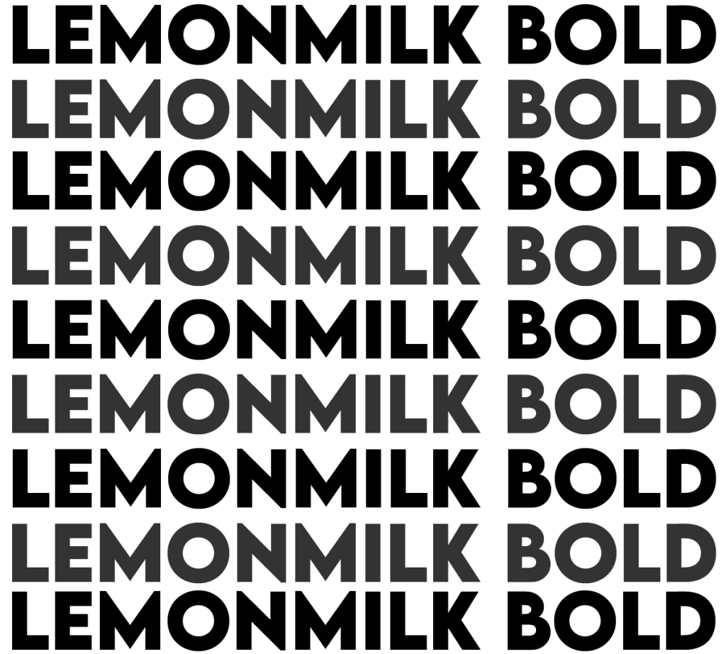
The logo’s typography is deeply conceptual. The prefix “Afri” is derived from Afrika, anchoring the brand in the vibrant, unique landscape of South African culture. To represent this cultural pillar, I utilized “LemonMilk” Bold, a sleek, geometric sans-serif defined by clean parallel lines and uniform character alignments that frame South African identity through a modern, contemporary lens.
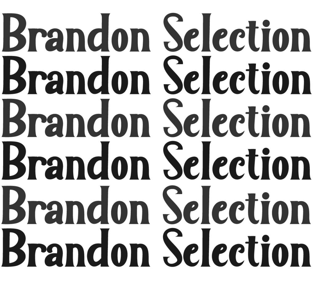
The second half of the logo, “Frans,” is the Afrikaans word for “French,” drawing direct inspiration from classic French high fashion. To articulate this sartorial heritage, I paired the bold prefix with “Brandon Selection Regular.”Its fluid, cursive script and delicate flourishes introduce an organic elegance that evokes a premium haute couture sensibility, creating a powerful typographic juxtaposition between modern South African culture and timeless European design.
For the secondary brand mark, optimized for social profile pictures; app icons; and compact spaces; I stacked “Afri” vertically on top of “Frans.” This arrangement creates a perfect geometric square. This compact sub-mark provides maximum legibility at smaller scales while maintaining the striking typographic contrast between the bold, modern block text and the elegant, fluid script.
The logo utilizes a strategic pairing of two distinct typefaces to bridge the brand’s modern aesthetic with the timeless elegance of classic French haute couture. For the “Afri” prefix, I selected “LemonMilk” Bold, a sleek, geometric sans-serif defined by clean parallel lines and uniform character alignments that anchor the brand in contemporary design. In contrast, “Brandon Selection Regular” was chosen for the remainder of the mark. Its fluid, cursive script and delicate flourishes evoke the sophisticated, ornamental romance of historic fashion houses, creating a balanced identity that feels both cutting-edge and deeply rooted in sartorial tradition.
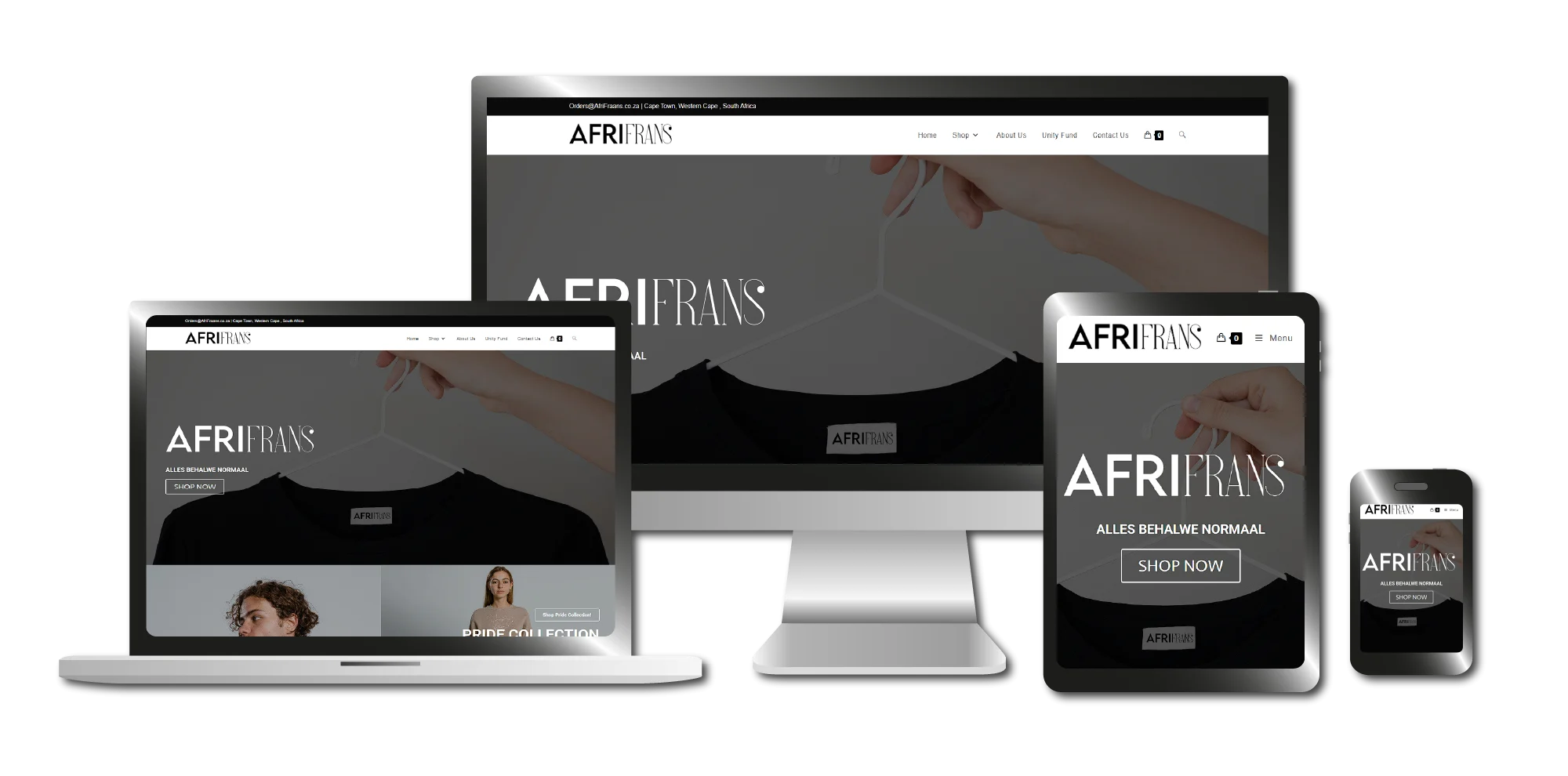
As the primary commercial hub for AfriFrans, the e-commerce website was engineered to seamlessly showcase the client’s complete catalog of apparel designs. I developed a fully responsive online storefront equipped with an intuitive browsing experience and a streamlined checkout funnel. By integrating a secure, automated third-party payment gateway, the platform effectively minimizes user friction and optimizes conversion rates across five critical user touchpoints:
Digital Storefront → Shopping Cart → Secure Checkout → Payment Gateway → Order Confirmation
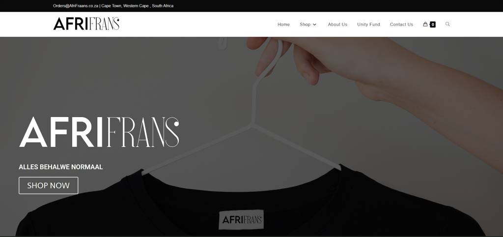
The website’s hero section utilizes a highly intentional, closely cropped photograph to establish immediate brand identity. The image features a human hand holding a minimalist white steel hanger, showcasing a t-shirt’s neck area where the AfriFrans label is clearly visible. Byterminating the frame just below the neckline, the composition intentionally cuts off the rest of the garment, subverting distraction and locking the user’s focus entirely on the core AfriFrans branding rather than the t-shirt itself.
Story Section
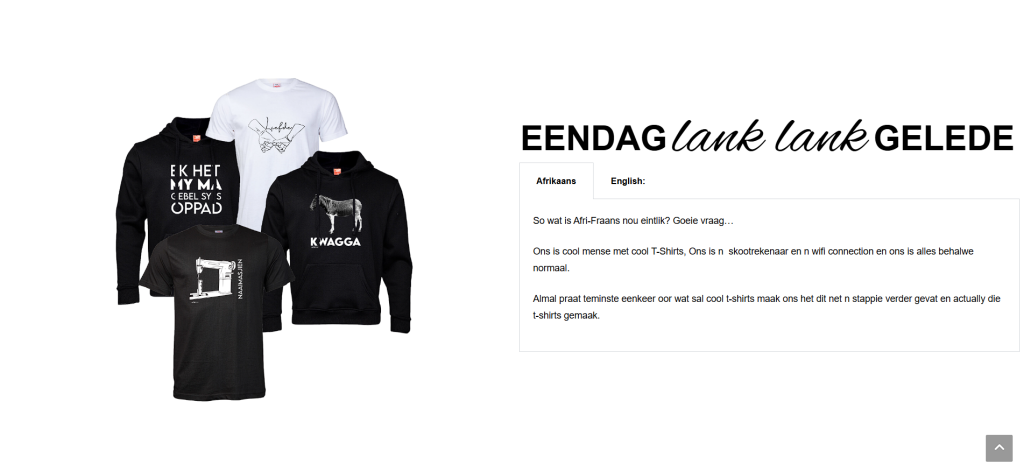
The “Our Story” section is structured as a balanced, two-column grid layout designed to bridge the brand’s visual identity with its heritage. One half of the grid displays a stylized, high-impact image showcasing a curation of AfriFrans’ most popular apparel designs. The adjacent column features a refined narrative overview, detailing the brand’s origins, cultural roots, and core ethical values.
Navigation Section
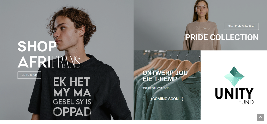
Positioned directly below the hero section, the navigation directory serves as an immersive digital crossroads for the user journey. Spanning the full width of the viewport, this section features a dynamic, asymmetrical grid layout that categorises the brand’s expansive catalog into distinct high-impact zones: the Pride Collection, the primary AfriFrans storefront, and rotating seasonal collections. This bold, grid-based architecture uses large, tactile touch targets to streamline user routing and facilitate rapid discovery of the client’s varied apparel lines.
Digital Storefront
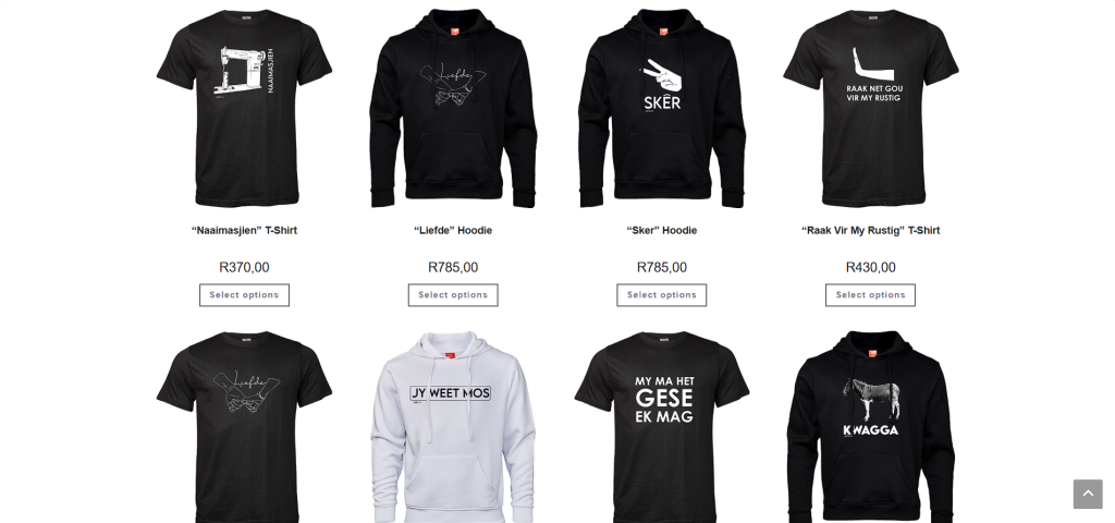
The primary AfriFrans digital storefront features a clean, minimalist e-commerce grid. Each product card details essential customer data at a glance, including high-resolution imagery, the product name, pricing, and an intuitive Call-to-Action (CTA) button. By implementing a dynamic “Select Options” quick-action feature, I allowed users to configure variants and add apparel directly to their cart straight from the catalog view, completely bypassing the single product page to accelerate the path to purchase.
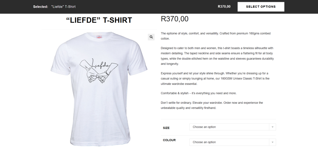
The single product page features a highly structured, hierarchical layout engineered to drive conversions and minimize friction. The core interface includes an interactive media gallery, clear pricing, compelling product descriptions, variant dropdowns, a quantity selector, and a high-contrast Call-to-Action (CTA) button. To proactively reduce post-purchase friction and lower return rates, I integrated utility modules onto each page, specifically a detailed garment care section and an intuitive sizing guide to ensure customers confidently select the correct fit online.
[ User Touchpoints ]
*Click on the images to enlarge them
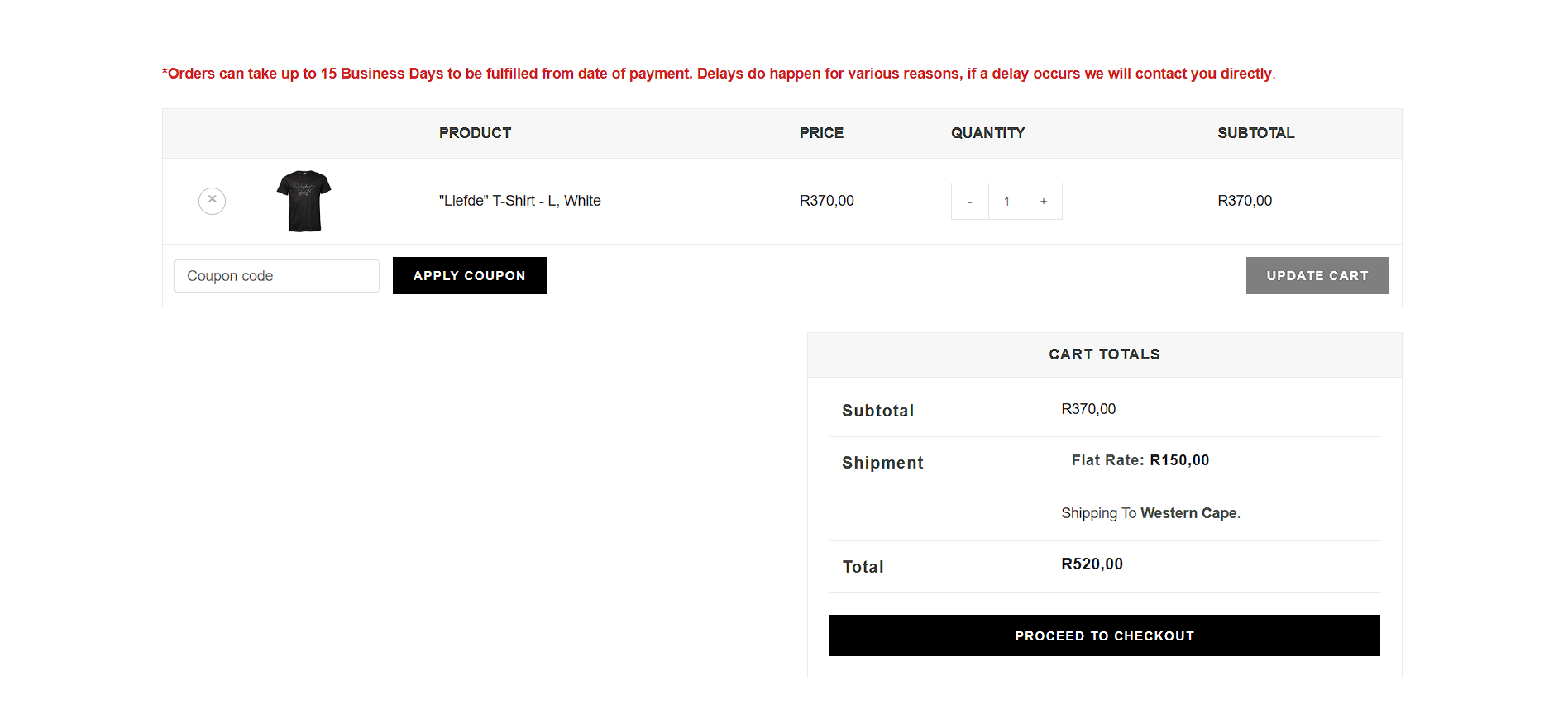
Cart Page
The cart page gives a straightforward breakdown of what’s in the basket. I made sure customers can easily change quantities or tweak their orderwith the totals updating automatically. To prevent any surprises, the flat-rate shipping fee is added right here alongside the product total, wrapping up with a clear button that takes the user straight to the checkout.
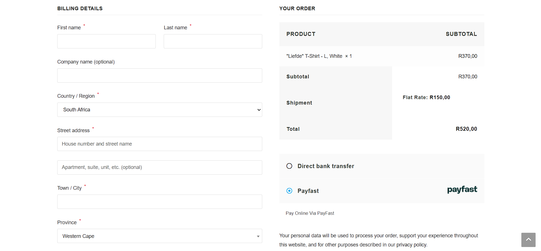
Checkout Page
I set up the checkout screen so users can easily input their shipping and billing details, choose their preferred payment method, and review a final summary of their order items and grand total all on one clear screen.
Payment GateWay
After the checkout screen, users are automatically redirected to a secure payment gateway where they complete their transaction. Once the payment goes through, the system brings them back to the site for their final order confirmation.
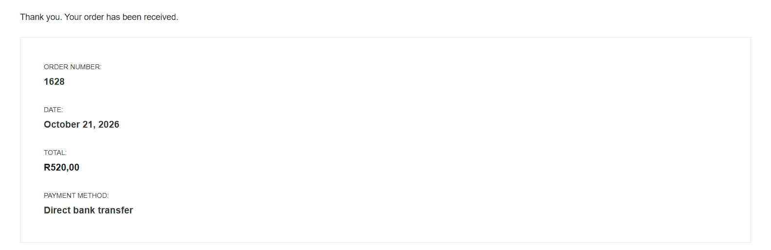
Order Confirmation #1
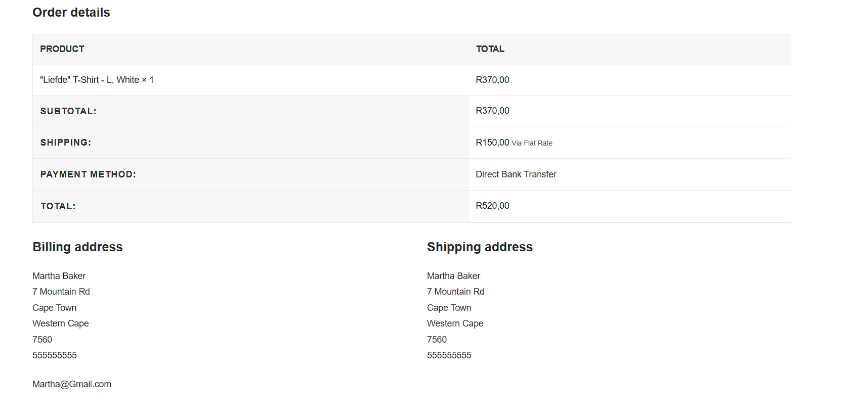
The top section of the order confirmation screen gives the user a clear snapshot of their transaction, showing their order reference number, the date, the final total, and the payment method used. I also set up an automated email that sends these exact details straight to their inbox right after the purchase goes through.
Order Confirmation #2
The second half of the order confirmation page shows a quick snapshot of the products ordered, the billing and shipping addresses, and the grand total. It’s a clean layout that wraps everything up perfectly, giving the customer one last look at their order details before they leave the site.
For the AfriFrans visual signature, I went with a stripped-back, minimalist palette using pure white and charcoal black. Keeping the color scheme entirely monochrome gives the brand a sleek, modern look that won’t clash with any colorful or intricate graphics. This makes the identity highly versatile, especially on physical labels, while the charcoal black introduces a subtle, premium texture that feels far more high-end than a basic default black.
[ Typography ]
For the AfriFrans typography, I carried over the same two fonts that make up the main logo: LemonMilk Bold and Brandon Selection Regular. This pairing brings a really nice contrast to the brand’s headlines and body text, balancing the crisp, rigid lines of LemonMilk with the fluid, cursive flair of Brandon Selection.
LemonMilk Bold
(primary font)
a b c d e f g h i j k l m n o p q r s t u v w x y z
A B C D E F G H I J K L M N O P Q R S T U V W X Y Z
1 2 3 4 5 6 7 8 9 0 ! ? &
Brandon Selection
(secondary font)
a b c d e f g h i j k l m n o p q r s t u v w x y z
A B C D E F G H I J K L M N O P Q R S T U V W X Y Z
1 2 3 4 5 6 7 8 9 0 ! ? &